How to Win With Experience
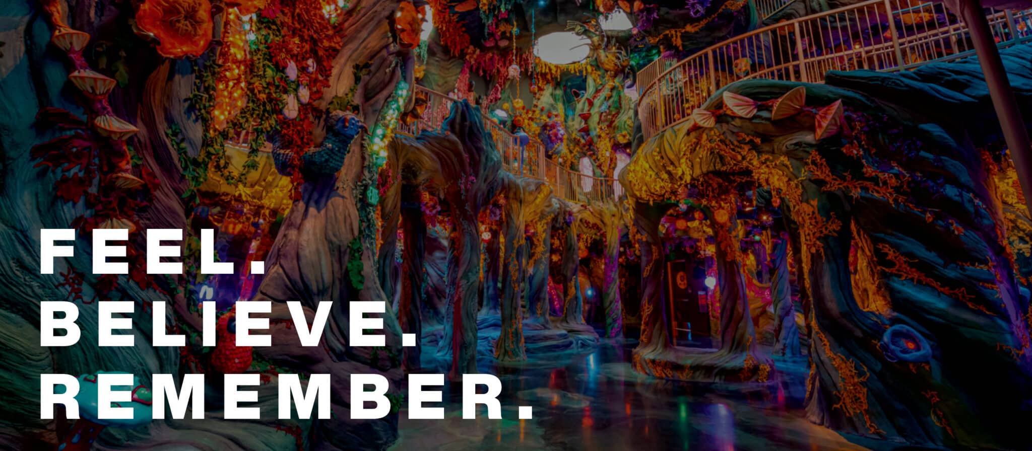
Image Courtesy of Meow Wolf | Jess Bernstein
Our team recently spoke at the NACS Leadership Forum, answering what is at the root of a truly great retail experience and what a successful store encompasses in today’s landscape. Here’s what they had to say!
What is experience?
When working with our clients at ChangeUp, we frame experience in terms of what we can and should influence when a guest or shopper engages with a brand.
Mapping customer journeys, role-playing the guest or shopper, being empathetic to their needs and wants, is a critical place to start. However, this can be very one-dimensional because it’s behavior-centered and has blind spots. We need to ask “What outcome is reasonable? What is the goal here?”
We also hear terms like “frictionless” and “removing pain points”, which are all desirable objectives, and the business value of that is easy to see. Of course, who wants pain? Removing pain points means a reduction in anxiety, frustration, and disappointment. This ultimately results in keeping customers in the store longer, having them shop more categories, and then ideally gaining a repeat customer—obviously a positive outcome. That is business value.
Where is the brand?
Pragmatic is always going to be pragmatic. But you must consider where the emotion and brand is and, what your relationship with customers looks like.
We certainly want to mine the customer journey for pain points and fix them, but we want to go deeper, and manage more of the experience in our favor, not only the guest’s.
There is more business value to be had, more differentiation and more distinction. We want to use the experience to build things, not just remove barriers and incrementally improve.
Experience principles, provide the recipe for our creative exploration.
This other side of the experience coin is what we attack in our process. We bring it to life through what we call Experience Principles. These principles direct what we can integrate into the experience that makes it more emotional, differentiated, and distinctive—to make it a brand-driven experience.
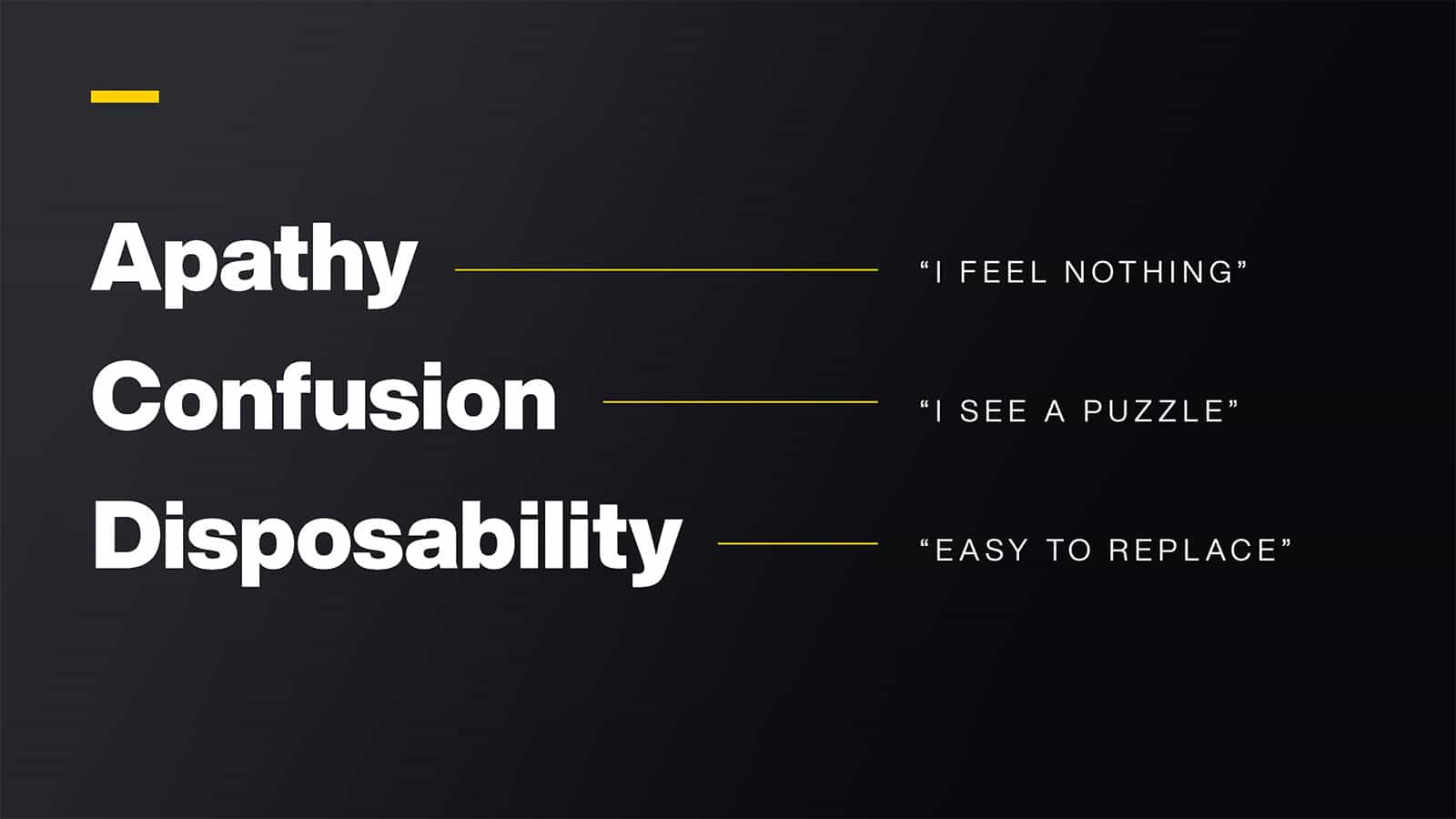
We began by rethinking what makes a “bad” experience, beyond the little unpleasantries, to seek a higher order, a bigger picture. We identified the things that threaten a successful experience and must be avoided.
By identifying what we don’t want in an experience, we can focus on ensuring that the brand comes to life in the choices we make when considering an ideal experience. These are the positive aspects we should be designing, managing, and measuring for—things that will create value and endure over time. And often, these are the blind-spots that we see in other approaches to experience design.
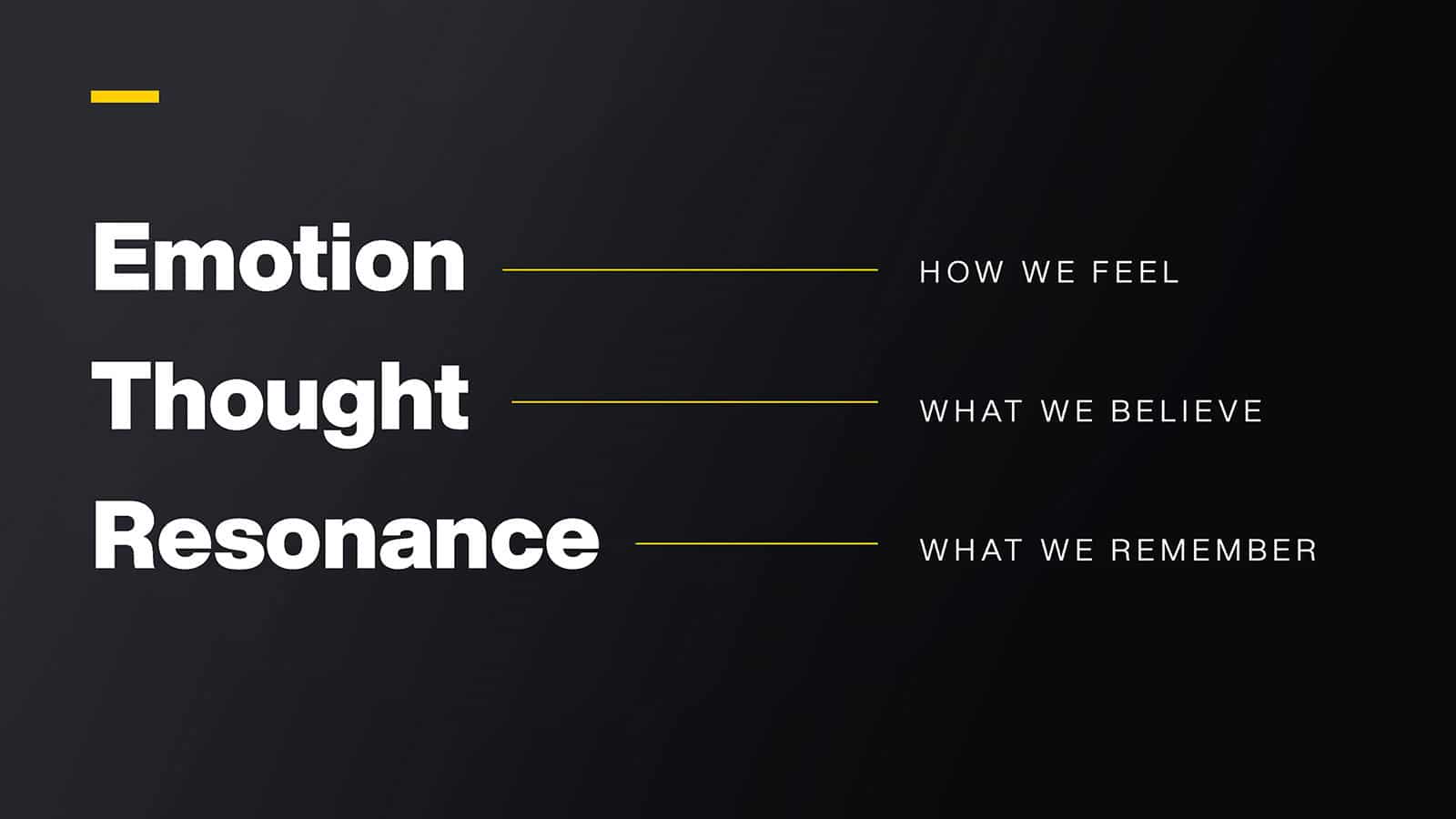
We believe an experience has the power to captivate and even transport a shopper through the emotions that they FEEL within a space. Experience has the power to create distinction, preference, or drive cult-like behaviorby getting customers to BELIEVE what a brand stands for. Experience has the power to create buzz, or maybe even start amovement by creating MEMORIES that last and drive action.
It’s not a one-size-fits-all approach. A powerful experience is a culmination of a deep understanding of the brand and what it stands for, creating business value, and a strong understanding of your customer.
We believe answering the questions of what we want our customers to feel, believe, and remember delivers a powerful experience for our clients.
So, let’s break them down.
FEEL
We start every project thinking about how we want our customers to feel when they walk into a space. Consider the emotions they may be feeling prior, during, and post. Are there aspects of the brand that only a physical experience can emote? This is more than paint, finishes, or a brand statement on the wall. It’s establishing a mood and mindset that represents who the brand is and how you should feel when interacting with the brand in the physical environment.
When we partnered with popular D2C brand Karl’s Fishing & Outdoors to design their first physical store, we created a space that would allow both new and experienced anglers to engage with the brand in fresh and memorable ways.
We had to design a store that not only reflected the Karl’s brand, but would consider the variety of shoppers that would be coming into the store and how we wanted them to feel when they walked in.
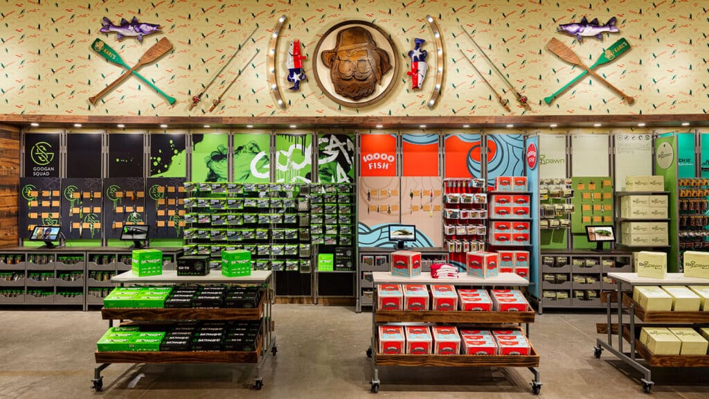
Fishing can be intimidating and complicated to a customer just starting out, so we had to create a more approachable environment that would give new anglers plenty of opportunities within the store to learn about fishing. We wanted them to feel comfortable in the space and excited to explore. One solution to this was installing digital features all throughout the store that include demonstrations of how products are used to catch fish. There are also interactive displays that let shoppers touch baits and see how they act underwater.
BELIEVE
Then we dive into what we want customers to believe. We need to clearly align with consumers’ values, and the mission or problem they are trying to solve. This is our key opportunity to be distinct and deliver the “why”. The goal is to feel validated, valued, and to attribute that to the brand. Consider what your true superpower is, what makes you different, and why consumers should ultimately choose you and tell that story with passion.
Let’s look at our work with Panera Bread as an example. Bread is the foundation of all their sandwiches and the perfect side to their soups and salads. Bread is what differentiates them from their competitors in and out of the store.
While their previous bread display was delivering on “we have bread”, it looked more like staged product rather than delicious product that customers would be enticed to purchase. After the morning rush, much of the wall and bakery display looked barren and unappetizing—but most important, customers did not know it was freshly baked in store.
So, when designing Panera Bread’s next generation restaurant concept, we wanted to highlight what customers should know and believe about the brand. We moved all baked items to the front, building appetite appeal and driving impulse and quality cues. The prepping, baking, and finishing of product moved to the front of house, showcasing the quality and freshness of the product. Within the case, the bakery items are merchandised like the artisanal bites that just came from the oven. Less products are featured to maintain the look of the case, so the display looks appetizing throughout the day.
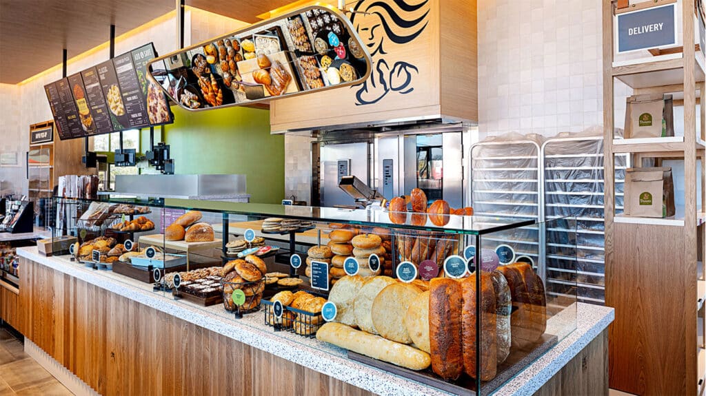
The end goal was not to sell more bread, but instead to use bread as their superpower to showcase the fresh, delicious, quality products they make to elevate the overall brand experience. Seeing is believing and in this case seeing the production is believing that Panera makes the best tasting, freshest food.
REMEMBER
This leads us to our last principle, Remember. What we want customers to remember are those signature moments within the experience that connect who you are with what you do. They should be highlights of the experience that are difficult or impossible for any other brand to deliver. The customer should easily recall the signature moments and use them in their descriptions of your brand to others.
One easy experiential example would be Walt Disney World, after all it’s the most magical place on earth and where dreams come true. But let’s be honest, it’s not attainable at scale. So instead, we want to talk about tires. That’s right, tires!
In the tire world, the customer journey looked something like this—drive to the store, go into the showroom and make a purchase, wait for the next available slot, get your service completed, and then finally get on your way. It’s far from a memorable experience and one lacking innovation.
So, we partnered with Discount Tire to design an entirely new way for customers to buy tires. The new concept, Pit Pass, is revolutionizing the tire buying experience and forever changing the expectations around purchasing tires. When building the concept, we considered what we wanted customers to ultimately remember about their experience at Pit Pass—Wow, this is the only way to buy tires!
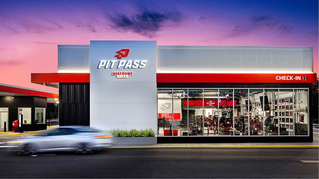
With a name like Pit Pass you expect a racing vibe, like you are part of the action. You feel a sense of simplified speed—it’s easy, but still innovative and fast—it’s not your typical tire store.
Where you previously spent hours waiting and watching through a window, now you take a front row seat in the experience that brings the speed of service to just 15 minutes. We took a digital-first approach to streamline the sales process—customers can now select and purchase tires and schedule appointments from the comfort of home or vehicle. The experience is memorable for customers because it sets a new, and higher standard for service.
Experience is defined as the sum-total of feelings, thoughts, behaviors, and memories of what happens to you. Yet it’s easy for businesses to lose sight of these factors and focus on behavior-centric engagements. But when brands follow these tried-and-true principles they set themselves up to win with brand-driven experiences. Shopping habits will continue to evolve, and to stay relevant in a rapidly changing world, it’s critical to meet new customer expectations by creating moments that make people feel, believe, and remember.
Related Topics
Related Articles
