×
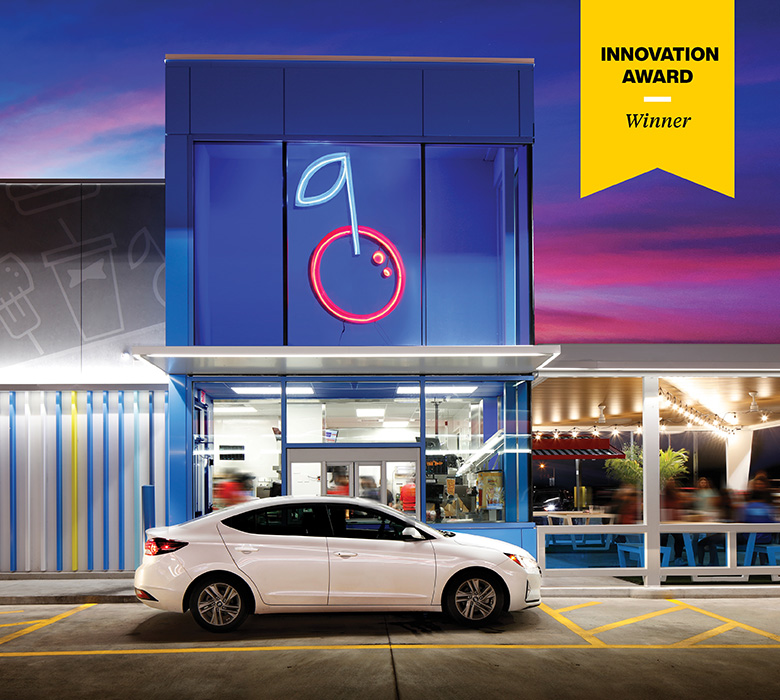
Sonic Wins Retail Design Institute Award
Our work with SONIC Drive-In won an Innovation Award for Graphics at RDI's 50th International Design Competition!
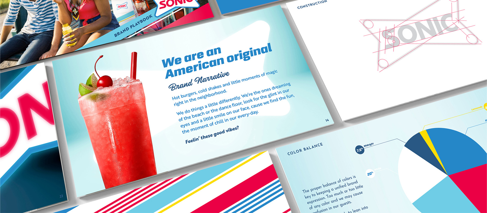
Caught up in nostalgia, Sonic needed to freshen its identity and restaurant concept without abandoning the charm as an American original.
STRATEGY / IDENTITY / BRAND DESIGN / RETAIL EXPERIENCE / ARCHITECTURE / CONSTRUCTION DOCS / ADAPTATION
Born as innovative and different in 1953, Sonic launched with pioneering technology that applied an intercom to the drive-in concept and the tagline “service with the speed of sound.” Feeling stuck in time, it sought to dust off its retro perception with a new brand identity and prototype for the future.
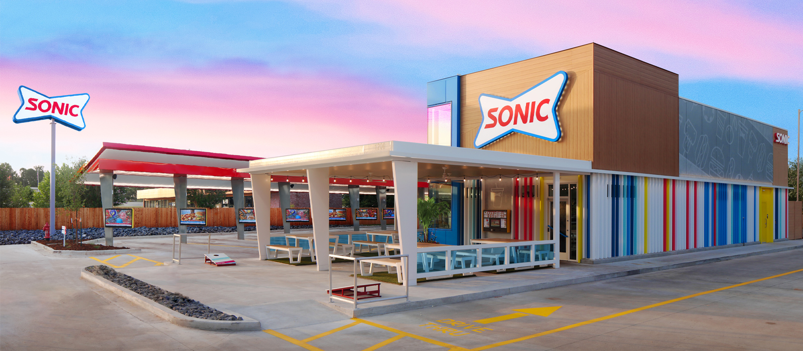
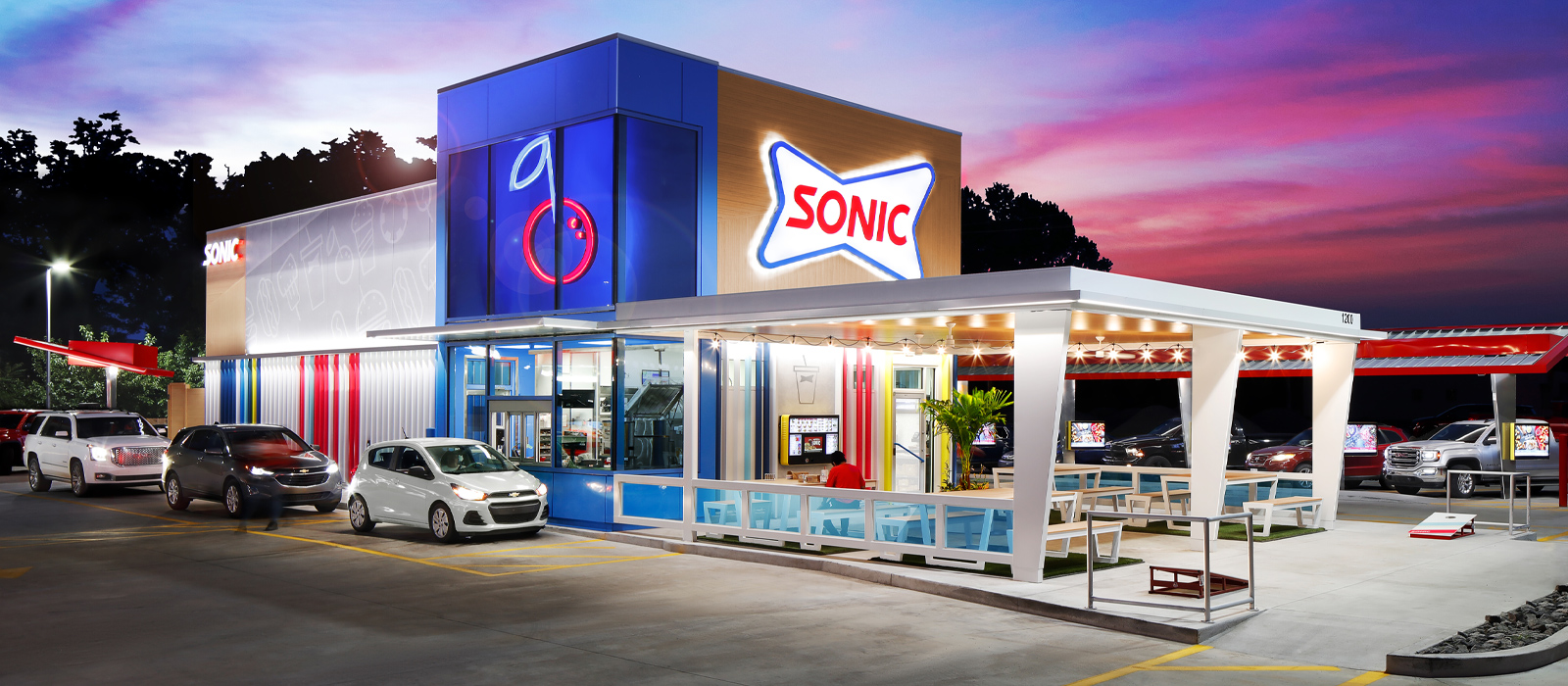
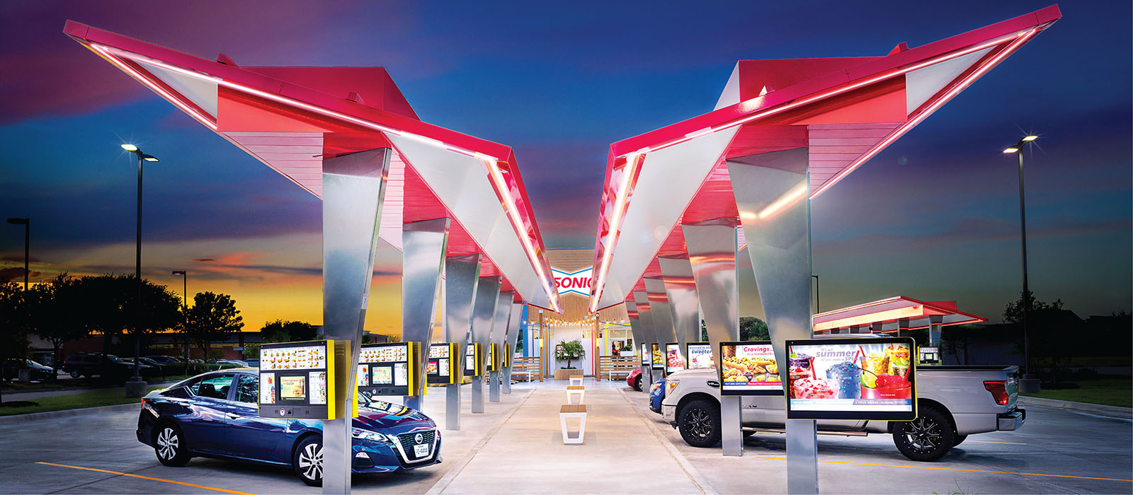
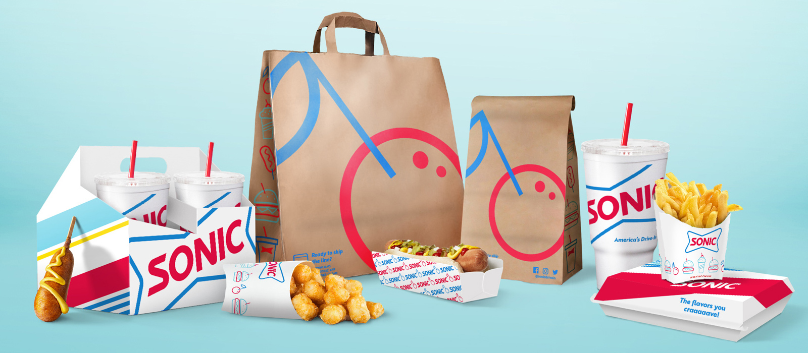
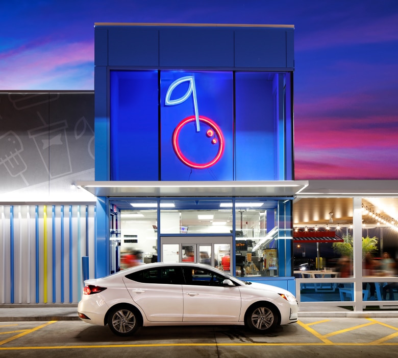
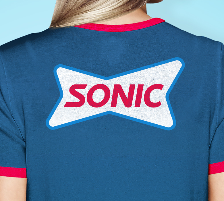
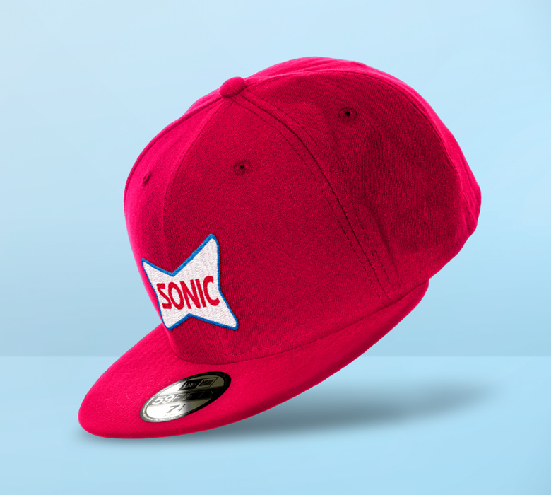
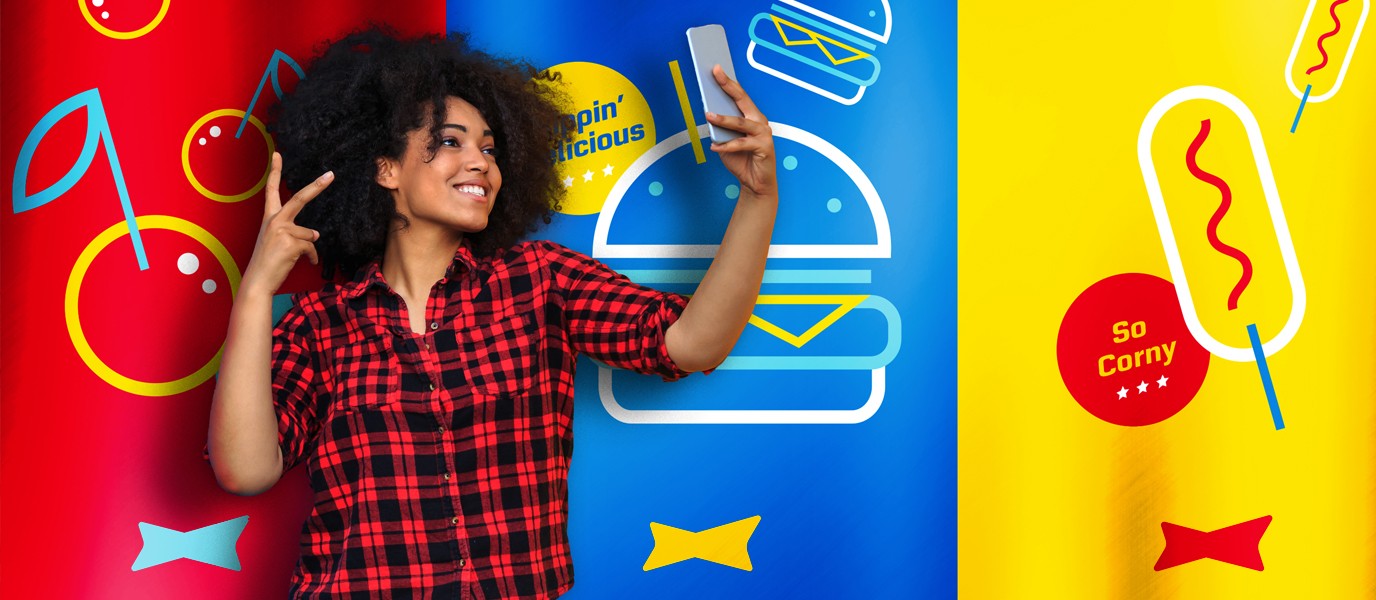
A fresh modern identity built in concert with the prototype that winks at the brand’s equity and creates new space for SONIC to become a little oasis in your daily routine. No part of this design is a copycat – from the patio options with string lights and lawn games to the elevated drive-thru with a blue glass tower featuring a brightly-lit cherry – a nod to the nine million Cherry Limeades that it sells each year. Every element of the design is unique to SONIC. Consumers now find the fun and moment of chill in their everyday that honors the brand’s charm.
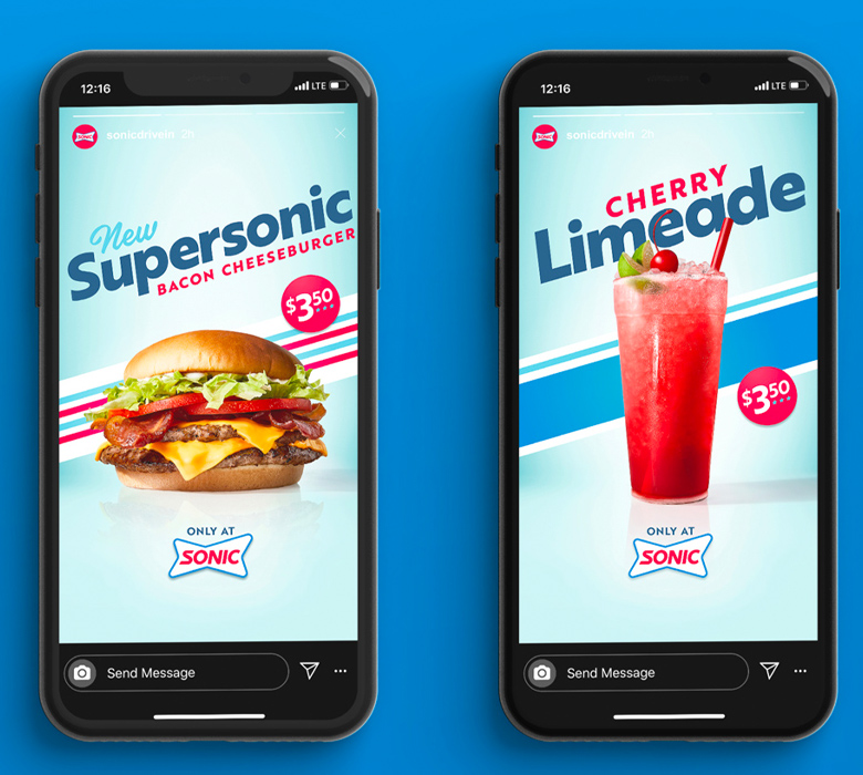
The new system and prototype are rolling out and instantly sparking curiosity & smiles. The new branding and purposeful elements behind the prototype design deliver the oasis vibes to standout against the industry usuals.
“We can now take our brand confidently into the future with a differentiated and engaging customer experience that positions us for growth over the next 10 years.”
CLAUDIA SAN PEDRO
President, Sonic
