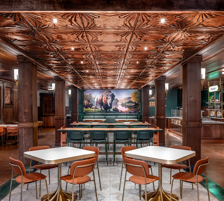
Transform Magazine features our work designing Buffalo Trace Distillery's first-ever cafe, offering a more immersive experience.
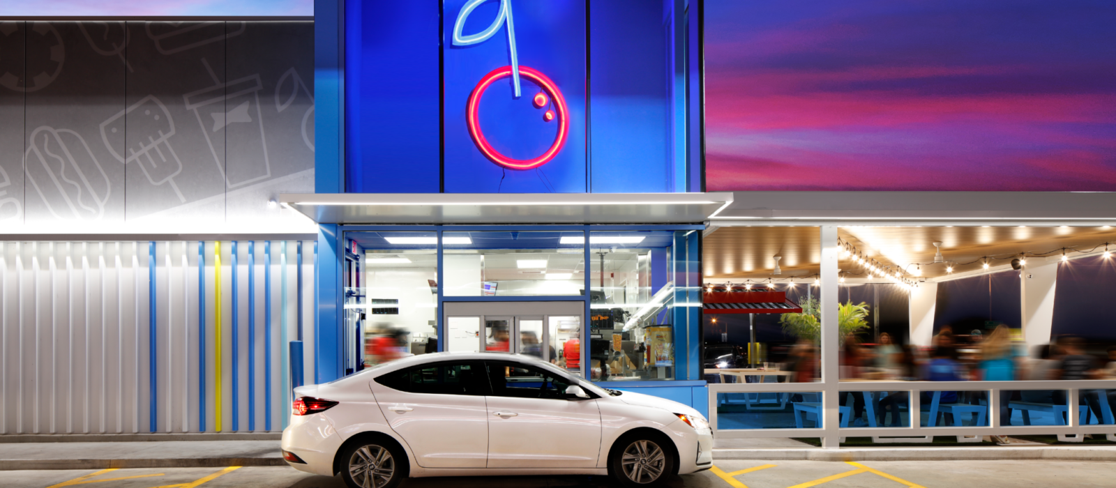
Originally founded in 1953 as future-forward concept – SONIC wasn’t intended to be nostalgic – it just never changed.
The design team at ChangeUp was asked to reimagine a modern brand identity that winks at the brand’s equity and creates new space for it. For this Oklahoma location the scope included drive through and drive in customer touch points.
A blue glass tower featuring a brightly lit cherry – a nod to the 9 million Cherry Limeades that SONIC sells each year – elevates the drive-thru and stands out at night. It also allows for a peek into the new kitchen layout.
The bold new logo design has a charm and quirkiness that’s all its own with a punched-up color palette, iconography, and fresh food and lifestyle photography.
SONIC, Tahlequah, Okla.
Design: ChangeUp, Miamisburg, Ohio.
Innovation Award for Graphics