Baskin-Robbins Wins GDUSA Award
Kicking off the new year with a “Seize the Yay” moment—our visual identity work with Baskin-Robbin wins a GDUSA Award.
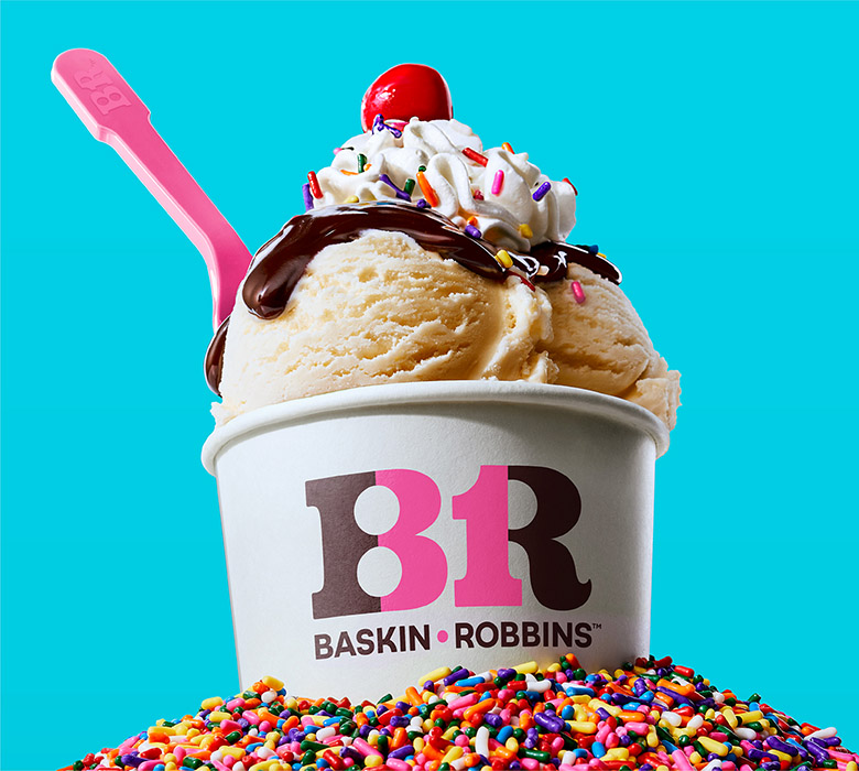
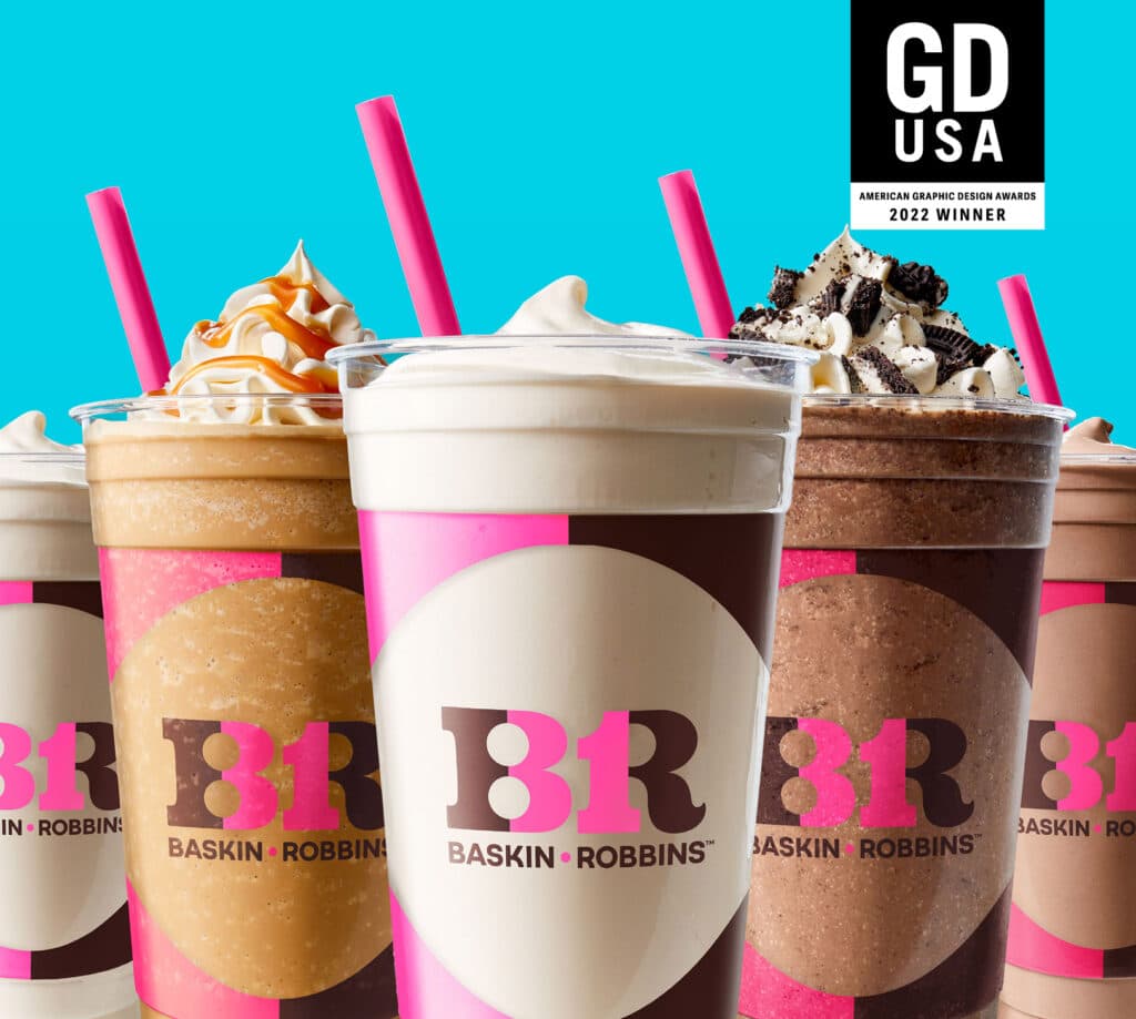
The beloved ice cream brand wanted to modernize its identity while still maintaining their iconic 31 flavor heritage.
IDENTITY / BRAND DESIGN
With a cult-like following, Baskin-Robbins is a brand that has the unique potential to transcend generations. The new visual identity system would turn fans of yesterday into brand loyalists of today and capturing Gen Z’s heart with everyday moments of “happy”. Equally as important is celebrating the quality and creativity of the product that founders Burt and Irv embraced from the very beginning.
Revolutionizing the brand meant taking a step back to understand the founding principles and earliest expressions of the brand. Leaning into their circus roots, the path to a younger, yet more sophisticated identity became abundantly clear. With its mid-century vibes, the new identity system is fun and bold retaining the “31” built right into the BR monogram itself. Every touchpoint received a makeover with a new color palette as the foundation – ice cream photography, packaging, uniforms and in-store graphics round out the system to create a cohesive and playful brand expression.
The new visual identity system was unveiled in April 2022, receiving a positive response from the industry and customers alike. Baskin-Robbins now personifies its mission to flavor every day with “happy” and stay “forever young”.