For the first time in their history, Baskin-Robbins was looking to take a global approach to the brand, delivering a refreshed identity while maintaining their strong connection with international customers.
IDENTITY / BRAND DESIGN / PACKAGING
Opportunity
After the successful launch of their North American brand refresh, Baskin-Robbins knew it was time to design an international expression of the visual identity system. With a strong brand perception abroad, the beloved ice cream chain would need to pull inspiration from their domestic counterpart while preserving customer loyalty and appealing to a new generation of ice cream lovers.
The Change
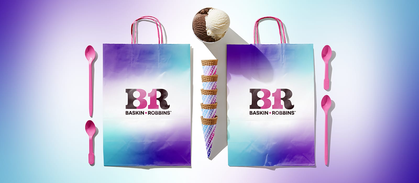
It was important to hold onto the core principles of the North American refresh, yet find new ways to elevate the identity based on differing perceptions internationally. We developed a fresh toolkit introducing rich gradient patterning as a principal element, implementing it into every touchpoint including packaging, in-store graphics, uniforms, and merchandise. The bold gradient patterns were integrated with the Baskin-Robbins logo and colors to create cohesiveness.
Impact
The identity system was revealed in the Fall of 2022 with the accompanying ‘Scoop the Joy’ brand campaign. The new look and campaign have already received a positive response across the globe, with customers excited to see the new expression in stores soon.
Related Articles