×

Our Innovation Agent, Scott Jeffrey, explores how future retail experiences will have to evolve once shopping for humanoid robots becomes commonplace.

A brand only has one opportunity to make a first impression. While many customers’ first touchpoint with a retailer is online these days, the power of a physical experience can make or break the relationship a customer has with a brand. One in-person experience can deter a shopper for life or help build long-lasting loyalty.
How a brand attracts shoppers in-person is fundamental to building a strong, holistic retail experience. And the importance of a retailer’s store exterior cannot be overlooked, as it serves as the prime vehicle to express their unique point of view. It can quickly position a brand as a destination worthy of guest entry. Equal parts billboard and brand portal, a great physical exterior attracts a shopper’s gaze and builds anticipation for the goods inside. With this in mind, we’ve compiled three high level principles that work together in order to define a successful store exterior:
Shoppers today are bombarded with content everywhere they look, both in and out of the store. A store exterior provides the opportunity to leverage the power of a brand’s unique visual identity and palette to make an impactful statement that draws customers in. Brands that have a defined visual system can artfully play up their greatest, most iconic visual assets to convey their distinct brand expression. This type of bold expression is what takes an exterior from something functional to something emotional that leaves a stronger impression on shoppers.

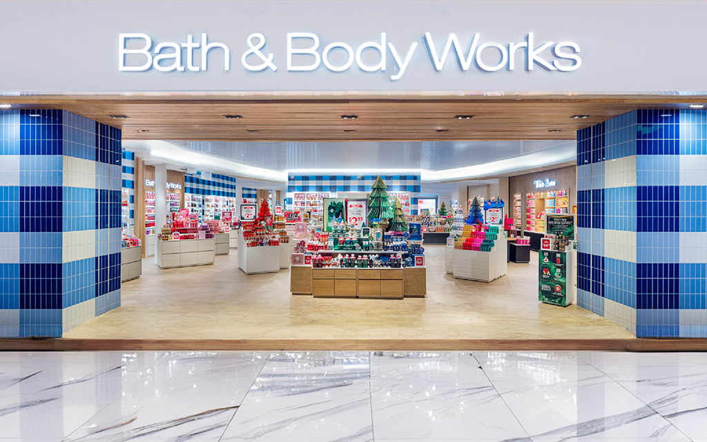
Take our latest work with Bath & Body Works. The brand was looking to modernize their built expression, while still getting credit for their most recognizable assets. We were able to boldly articulate the brand’s iconic gingham pattern as a tile installation to humanize and bring both originality and brand cohesion to the storefront. Additionally, a wooden portal overhead clearly defines a threshold to envelop and artfully transport the guest (and their mindset) as they cross from the mall concourse to inside the store. It also remains paramount to Bath & Body Works’ strategy to engage the senses. The solution is a new, wide entry that spotlights featured products to further emphasize seasonal storytelling and discovery.
A visual hierarchy is critical to attracting guests and enticing them to learn more about what’s inside your store. While a grand scale can be the initial draw that captures customers in, it’s the human scale that helps tell stories that are important to the brand. As a shopper gets closer to entry and engages more intimately with a store, it should create moments that humanize the brand. The unspoken impact of balancing architectural scale, down to the pedestrian level, allows for a more expansive understanding of a brand and creates a pull for customers to further engage.

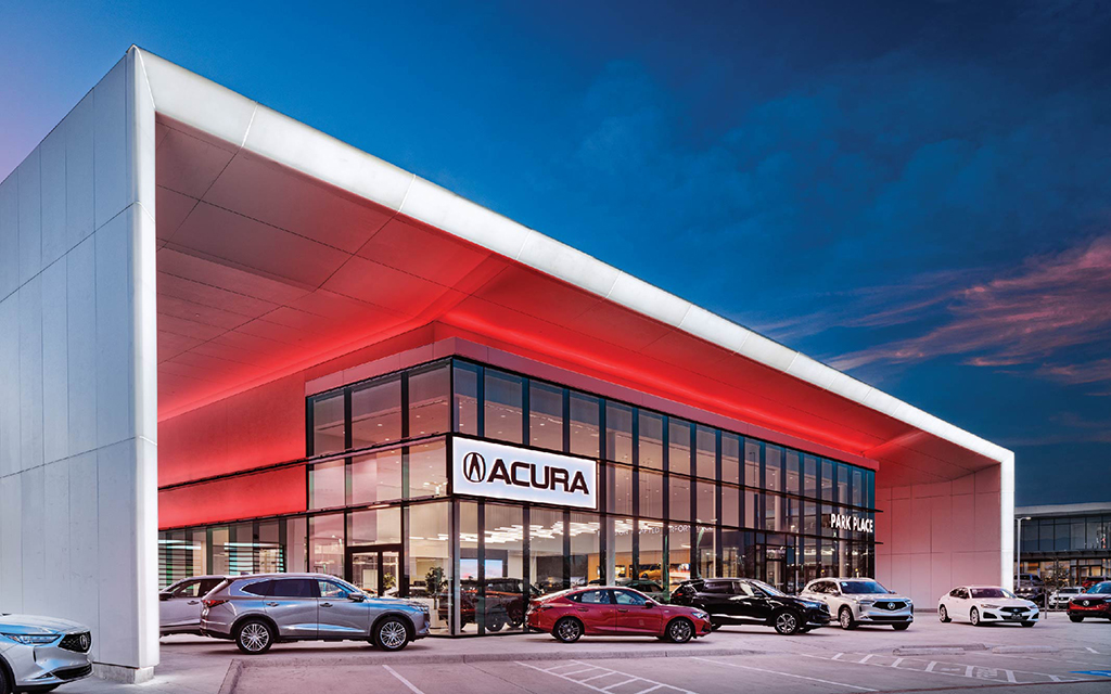
For our recent design collaboration with Acura, we reimagined the brand’s exterior with a clean and modern expression that works double duty to present the cars with striking impact and set the stage for the expanded dealer services inside. Cars are big merchandise, so the grand scale of the cantilevered architectural frame dials up the drama. The light canopy that wraps the entire width of the facility lights up the building, day or night, making its presence feel even bigger despite a smaller footprint. Even more so, it brings a level of detailing and intention to further elevate the brand projection beyond a standard execution. And as guests get closer to entry, the open floor plan, floor to ceiling windows, and clean lines all play a role in allowing the cars to shine.
Working within the confines of real estate and jurisdictional governance, smart exterior designs consider inevitable limitations while expressing anew to punctuate against the competitive landscape. Think of a grocery store shelf – every brand is looking for their products to stand out despite the same confines. The streetscape is no different. Thoughtful solutions can maintain the integrity of an inherited site, while still conveying impactful street level presence. This allows the brand to color within the lines AND claim their frontage. Materiality with interesting textures, lighting (both thematic and decorative), and attention to detailing provide additional tools with which stores can activate and differentiate.

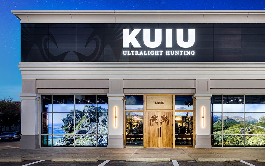
For D2C brand KUIU’s first flagship, we used its store exterior to go beyond signage to make a strong branded statement that punctuates against the inherited shopping district. Black cladding, wooden storefront system with branded doors, and tasteful sconce lighting confidently convey the KUIU brand. It was important that upon arrival, the store helped get customers in the right mindset for their once-in-a-lifetime adventures. We implemented lightboxes against the large glass windows to feature expansive landscapes that showcase their gear and apparel in action. We used the exterior to bring KUIU’s products to life and transport shoppers before even stepping foot inside the store. By closing off the windows and using the graphics to get customers excited about what’s to come inside, we were also able to create a more emotional response upon entry.
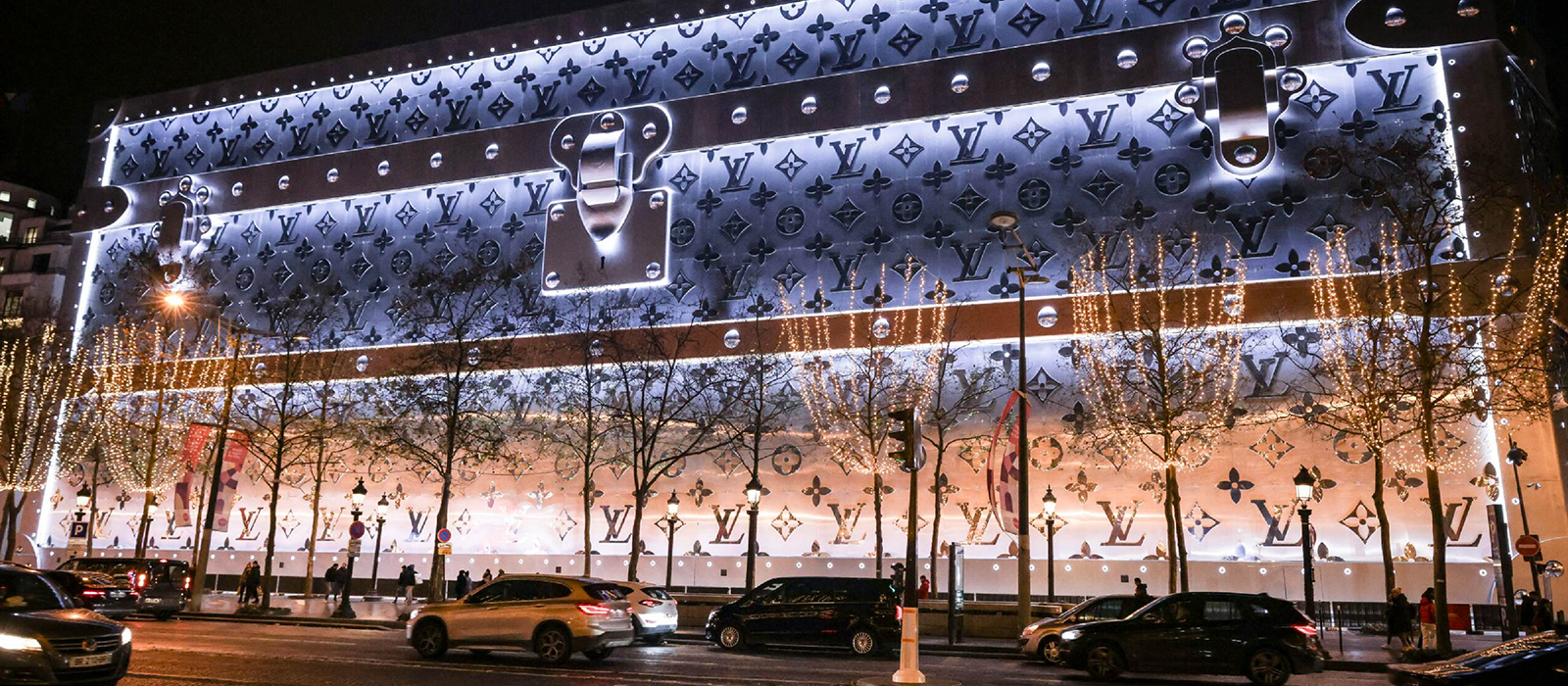
At ChangeUp, we believe it’s important to infuse each of these strategies into a store’s exterior (take Louis Vuitton’s building in Paris.) Each strategy is a critical tool to provide retailers with power to promote their brand and attract their guests. But retailers must think more holistically about how they build upon that first impression once guests actually enter their store. How can your exterior better support and amplify your efforts? Does your store experience deliver on the promise of your exterior?


