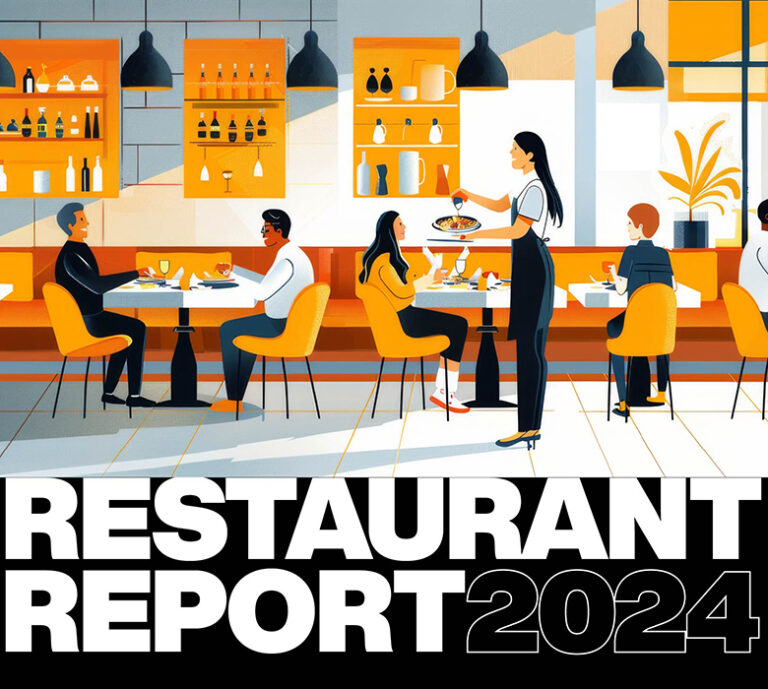
We explore why it’s good for business to stand out in a world of sameness.
It’s hard to think of a legacy QSR restaurant chain that has not redesigned their concept in the last decade. In most markets, “fast-food row” has been given a facelift, and considering how many concepts aged poorly, we are the better for it. The problem is, everybody seems to be using the same design playbook—and that’s ultimately not good. Who wants to spend time, money, and resources to change, just to end up like everybody else?
This isn’t the first time design took a “formula” to extremes. Future cultural anthropologists will sift through the residue of 20th and early 21st century American history to see clear periods of roadside architectural motifs. First the “space-age” period of early eccentric, mid-century modern designs, like the original McDonald’s double arch and slant-roof hut. Then the more cost effective, “crank-‘em out” mansard roof period—decorated boxes baby-boomers know and (maybe) love. Turns out that the best gift the mansard gave us is that it’s fairly easy to remove.
Pre-COVID, we found ourselves in the “corner-tower builder” era (cynical references to steeples withheld). The result? A “build it and they will yawn” formula that was technically new, but not notable.
And while the pandemic forced brands to think about their physical spaces in “new” ways, we’re still left with just more of the same. Yes, we’re seeing updates that include improved integration of technology and better consideration for varying customer journeys. Yet, there’s still not a lot of differentiation between restaurants.
Formulaic approaches soon become dogma, and there is resistance to try something outside of convention. Add to this a common motive to evoke a warmer, more natural, more premium, more experiential image, and a desire to import the language of fast casual, and the results all point towards the same outcome. As a result, the identity, along with a splash of brand color, become the workhorses of differentiation on the exterior. It’s safe to say that a new restaurant under construction today will keep its identity a mystery until the painters and the sign company show up.
The same holds for the interior designs. One factor is that the operational models are all similar, leading to the same design challenges—service counter (or now with kiosks), menu board, drink counter, seating, and (for a while) a kid’s play zone. Even the size and shape of the lot dictates a level of sameness. The common DNA leads to a similar species of design language and materials.
It can be hard to pin down the first mover in these trends, as if there is some sort of spontaneous creative “eureka” experience that, unlike lightening, does strike more than once. Regardless of origin, the issue is the lack of originality results in missed opportunity!
In a dogmatic world, similar is safe—but in a competitive world, different is always better. Different involves risk. What we have learned through experience is that most risk is not real, but perceived. Navigating through the decisions to determine what is a real risk, what is an uninformed bias, and what may actually be a hidden risk, are all part of a smart process. The work pays off in something that is right for only your brand and connects powerfully with your desired customer.
It is imperative to become aware of what is dogma, and identify where to break from the pack. ChangeUp has created 5 opportunities to fight the formula without merely creating the next formula.
1. Change the Brandscape
Think of your last grocery trip. The cereal aisle is a great example of lowest-common-denominator differentiation. Every brand has the same roughly 8” x 12” surface to identify their brand and grab your attention. No wonder there are 15 varieties of Cheerios! It is about dominating the visual real estate with the brand. Fortunately, a QSR restaurant has more opportunities to differentiate than a cereal box front. Use the entire restaurant and create a distinct silhouette that rejects a corner tower. The goal is to identify what is common and intentionally do something opposite. Be the bottle on a shelf full of boxes.
2. Scale the Experience
Due to our lives being rife with digital screens, we increasingly see ourselves stationary and the world playing out at arm’s length. A building exists in real-life, so designing it as an object to be seen as an “icon” from a fixed distance isn’t enough. It misses the opportunity to provide dynamism and mystery. See the exterior as at least three levels of engagement tied to movement, each with different purposes—distinctive and interesting from afar, revealing and provocative from the parking lot and drive-thru, warm and welcoming at the entry. Each level creates a memorable impression in the minds of customers as they pass through, and provides a way to differentiate your restaurant from competitors.
3. Get Quirky
Spend an hour on Pinterest and you will see why it can be so addictive. It’s a fire-hose of creativity and visual stimulation. It shows the transformation of ordinary things into out-of-the ordinary solutions and ideas. It has upped the ante for creative expectations, democratized the maker mindset, and fueled unique self-expression. Brands need to reflect this in how materials are used inside and outside and how often they may inexpensively need to change, with the goal of staying relevant and interesting.
4. Find Your Inner Human
Chain restaurants don’t have to be chained to huge corporate personas. Somewhere under all those stock symbols and IPOs are real people with real purpose, genuine personalities, and interesting things to say. Nobody ever starts a conversation with their favorite floor tile specification. They tell stories—and stories build understanding, establish shared values, and express humanity. What your story is and how it is expressed is fundamental to the design of the restaurant interior. It deserves to be told and must be more than a single wall graphic and cute saying on associate tee-shirts (although that’s a start).
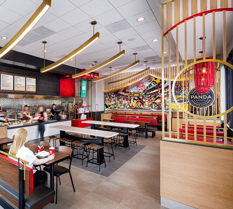
Take ChangeUp’s latest work with Panda Express, where we designed a new prototype that was unique to the restaurant chain’s story and origin. As a family-owned business, Panda Express was passionate about taking a detailed and purposeful approach to create a space that celebrated Chinese culture with the modern American guest. Inspired by the Lunar New Year, every touchpoint was considered to ensure authenticity and meaning, from the custom hero mural to the terrazzo tables symbolizing Chinese New Year confetti.
5. Go Big AND Go Home
The expression “go big or go home” doesn’t apply here. Localize the restaurant as much as can be managed to make it feel a part of, not apart from, the community. As a rule, the younger the consumer, the more distrust they have in brands, so start thinking about how the brand can be an ingredient in the lives of the local community and add to its sense of place. This can require some finesse and local smarts that most chains don’t have, so the franchisee can become the mechanism for making this happen—they just need some guidance, because the motivation usually already exists.
Unlike a cereal box covered in ink, a restaurant has to be built in place using off-the-shelf structural components, with reasonably available materials by commonly skilled tradespeople. It also has to deliver the right unit economics to be built in the first place. That doesn’t mean it has to play by someone else’s rules. In the end, it’s about getting the most out of the investment, and no one should want to invest in conformity. At ChangeUp, we can work with you to look beyond ordinary to find extraordinary, navigating the risks and defining the rewards to create something fresh, and truly unique to your brand.